top of page
LOGO DESIGN
SOLDIERS FIELD BRANDING
The city of Rochester needed a fun and playful branding for the new 20 million dollar redesign of the soldier's field space. I feel the bold colors and unique "Spaghetti People" achieved just that.
PIZZA QUEEN
Long live the Queen! These clients have always had amazingly creative business ventures and I have been blessed that they come to me to help them bring them to life. They wanted a fun in-your-face brand that played off the term "Queen". Vibrant colors and play on photography kicked this branding to royalty status.
HOMEBOYS
Same box-busting clients as Pizza Queen, but this time in the sandwich space. they wanted a 90's nod to roughhousing, skateboarding, boombox rocking, and punch you in the face with the retro vibe.
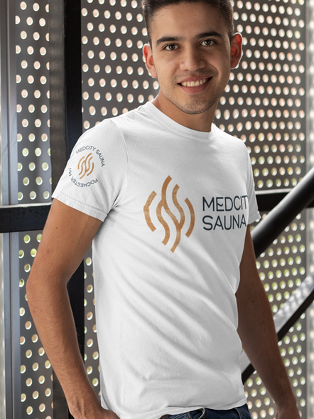
MED CITY SAUNA
I was delighted when my boss who gave me my first real job at 19 circled back and asked me to brand his retirement project. He was looking for a sharp and modern feel to his logo and loved this orange color.
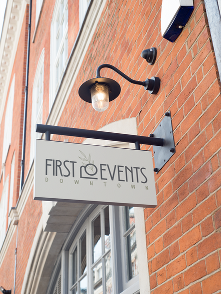
FIRST EVENTS
First Events wanted to transform a restaurant into an event space, keeping the existing nature theme. A modern logo was able to be sharp and eye-catching without taking away from any event that would be in this space.
bottom of page


